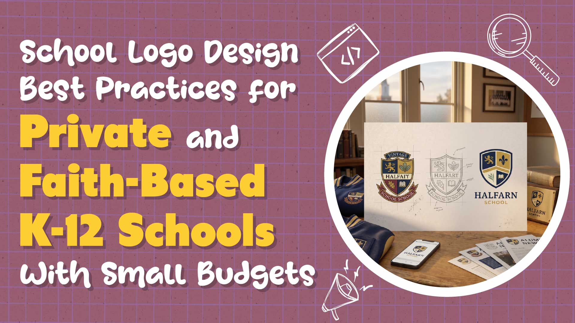
Your logo shows up on jerseys, report cards, the sign at the school entrance, every Facebook post, every parent newsletter, and the chest of a graduate's sweatshirt twenty years after they left. A good school logo is the smallest piece of your marketing and the one that travels the furthest. A bad one is a scar you see every time you pull into the parking lot. For faith-based and independent schools without a big budget, getting the logo right is the single highest-leverage brand decision available.
This guide is written for a principal at a 150-250 student faith-based or independent K-12 school with tuition around $3,000-$5,000 and a marketing budget of $5,000-$15,000. It covers the main types of school logos, the principles that separate a logo that ages well from one that has to be replaced in five years, how to handle a legacy crest or outdated mascot, the file deliverables you actually need, the cost range for getting it done professionally, the mistakes that small schools make most often, the trademark and legal basics, and how to roll out a new logo without a community revolt.
What Types of School Logos Are There?
School logos fall into six common categories. The right type depends on the school's history, audience, and how the logo will be used day to day.
Crest or Coat of Arms
The classic independent-school logo. Detailed, heraldic, carries decades of community equity. Works beautifully on letterhead and engraved signage; struggles at small sizes on mobile screens and favicons. Most schools with a crest need a simplified secondary mark for digital use.
Wordmark
The school name is styled in custom or carefully selected typography, often with minimal ornamentation. Clean, modern, and scalable from business cards to stadium scoreboards. A good wordmark is durable for 10-15 years.
Monogram
An abbreviation or stylized initials ("SMA" for Saint Mark's Academy, for example). Excellent for secondary applications like uniform patches, favicons, and social avatars. Typically used alongside a primary wordmark or crest rather than as the only mark.
Pictorial Mark
A graphic symbol that stands in for the school, often tied to a mascot or natural feature. Effective when the school has a strong physical symbol (a building, a tree, a local landmark). Requires careful simplification to work at small sizes.
Combination Mark
A logo that combines a pictorial element with a wordmark or crest, arranged together. The most flexible option for schools that want both historical weight and modern scalability.
Mascot Mark
The athletic or spirit mark, usually an illustrated character (a tiger, a cardinal, a founding figure). A mascot mark almost always exists alongside the primary school mark, not instead of it. Athletic branding is its own layer of the identity system.
How to Choose
For most small private schools, the right structure is a primary crest or wordmark used for academic and formal contexts, plus a simplified secondary mark (often a monogram) for digital and athletics. Pictorial-only schools should have a strong reason tied to a specific symbol. Mascot marks should never replace the primary identity.
What Makes a Great School Logo?
Seven principles separate logos that work from logos that need to be replaced within a few years.
Simplicity
A great school logo can be drawn from memory by an 8-year-old. Complicated heraldic crests have their place, but even those should have a simplified version for day-to-day use. The rule of thumb: if you cannot recognize the logo at 32 pixels square, it is too complicated for modern usage.
Scalability
The logo must work from a 16-pixel favicon to a full wall-sized banner at an athletic event. Vector design from the start (SVG, AI, or EPS source files) guarantees scalability.
Versatility
A usable logo suite includes at least horizontal, stacked, and single-color variations. It must work in full color, one color (typically black and white), and reversed on dark backgrounds. A logo that only functions in full color on white is incomplete.
Memorability
Simple, distinctive marks are the ones parents remember. If your logo could be mistaken for three other local schools' logos at a glance, memorability is an issue.
Durability
A school logo should age for at least 10-15 years without feeling dated. Avoid design trends that scream a specific year ("2015 hipster serif," "2020 gradient-heavy," "2024 AI-illustration").
Legacy Connection
For schools with a history, the logo should maintain a thread to previous marks. Alumni should recognize what has been preserved; current families should feel the evolution.
Distinct From Competitors
Before finalizing, check the logos of the nearest ten schools in your market (both private and public). If yours is indistinguishable from three of them, something needs to change.
How Do You Update a Legacy School Crest Without a Revolt?
A legacy crest carries the emotional weight of every alumnus and every family who has attended the school. Modernization has to happen carefully.
Preserve the Core Symbols
Identify the two or three elements of the crest that carry the most equity: a shield shape, a specific symbol (open book, cross, flame, local landmark), the school colors, or a motto. Those stay. Everything else is modernizable.
Clean Up Line Work
Most legacy crests were drawn in the era of printed illustration. Digital reproduction benefits from simplified linework, tighter proportions, and cleaner negative space. Keep the recognizable silhouette; improve the craftsmanship.
Refresh Typography
Old crests often contain dated typography, particularly in the motto or school name. Replacing the type with a refined, period-appropriate serif often modernizes the overall impression without changing the character.
Add a Simplified Secondary Mark
The crest remains the primary ceremonial mark. A simplified monogram or wordmark becomes the day-to-day digital identity. This two-layer approach gets you the best of both: heritage for formal contexts, clarity for digital.
Communicate the Change
Before the new marks are public, write a short explanation for the school community: what is changing, what is staying, and why. Alumni backlash most often stems from surprise rather than the design choices themselves. A clear heritage-aware narrative disarms most of it.
Handle Mascot Logos Separately
An outdated or culturally insensitive mascot needs a separate conversation from the primary mark. Keep the two conversations distinct to avoid confusing the community about what is being changed.
What File Deliverables Does a School Need From a Logo Designer?
A complete logo package is not a single file. The designer should deliver all of the following, organized in a logical folder structure.
Vector Source Files
- Adobe Illustrator (.ai) or SVG source file for the primary mark
- Same for every secondary mark and lockup
- Editable text converted to outlines for any typography embedded in the mark.
Web-Ready Formats
- SVG for modern web use
- PNG with transparent background (three sizes: small, medium, large)
- Favicon (.ico) at 32x32 and 16x16
Print-Ready Formats
- EPS for professional print
- PDF at print quality
Color Variations
- Full color
- One-color black
- One-color reversed (white on dark)
- Pantone color references (uncoated and coated)
- Hex, RGB, and CMYK values for each brand color
Layout Variations
- Primary mark
- Horizontal lockup (name and mark side by side)
- Stacked lockup (name and mark vertically arranged)
- Monogram or simplified mark for small applications
Minimum Size and Clear Space Guidelines
- Smallest acceptable size for print and digital
- Clear space requirements (how much empty space must surround the logo)
If a designer delivers only a JPG of the new logo, push back. A proper package protects the school for the next decade.
How Much Does a Professional School Logo Design Cost?
Realistic cost ranges for 2026:
| Option | Typical Cost | What You Get |
|---|---|---|
| DIY logo tools (Canva, Looka, Hatchful) | $0-$150 | Template-based mark; rarely school-appropriate |
| Online marketplaces (99designs, Fiverr) | $200-$1,500 | Custom work; quality varies widely |
| Freelance designer | $500-$3,500 | Custom mark, file suite, basic brand sheet |
| Regional agency | $3,500-$15,000 | Full suite, guidelines, stationery design |
| National brand firm | $15,000-$75,000+ | Strategy-led identity, full system, rollout |
For most small faith-based or independent K-12 schools, the right fit is a freelance designer with school experience, budgeted at $1,500-$3,500. That range delivers a custom mark, a proper file suite, and a basic brand sheet; it produces work that ages well without requiring an agency engagement.
What to Ask a Freelance Designer
Before hiring:
- Can I see three to five school logos you have designed in the last two years?
- What deliverables are included at the quoted price?
- Do you deliver vector source files (AI or SVG), or only rasterized files?
- How many concept directions do you present?
- How many rounds of revisions are included?
- How long will the project take from kickoff to final delivery?
- Do you include minimum size and clear space guidelines in the deliverables?
- How do you handle trademark searches and clearance?
Community-Sourced Options
Local college or high school design programs sometimes partner with small schools on pro-bono or heavily discounted logo work. Quality varies, but with a clear brief and an experienced faculty advisor, the results can be excellent. Parent volunteers with professional design experience can be enormous assets, provided the relationship is treated with the same discipline as a paid engagement.
What Logo Mistakes Do Small Schools Make Most Often?
Five patterns show up in almost every small-school logo audit.
Too Complex to Scale
A highly detailed crest with six elements and three typography sizes that works on a letterhead but dissolves into noise on a favicon. Fix: create a simplified secondary mark.
Hard to Read at Small Sizes
Tiny school name below a large symbol, illegible at anything under 200 pixels wide. Fix: revise the hierarchy so the mark works at the smallest intended size.
Clip-Art Mascots
The 2003-era snarling tiger was clearly found in a graphics clip-art pack. Fix: commission a fresh illustration tied to the school's actual personality.
Outdated Typography
A mid-1990s display font paired with a 1970s shield. Fix: refresh the typography to something that reads as timeless rather than dated to a specific era.
Inconsistent Use Across Athletic and Academic
Two totally different logos, one for sports and one for academics, that do not share any visual DNA. Fix: document an identity system where the athletic mark clearly relates to the academic mark (shared typography, color, or signature element).
What Legal Considerations Apply to School Logos?
A short list of legal basics every school should know before finalizing a new logo.
Trademark Search Before Committing
Before committing to a new mark, run a basic trademark search through the USPTO's TESS database for potentially conflicting marks in education and related classes. A designer should help or recommend a trademark attorney for deeper clearance.
Consider Registration
For schools with distinctive names or marks, registering the trademark with the USPTO (roughly $250-$350 per class per application plus attorney fees if applicable) provides legal protection against confusingly similar marks in the same category. Not every small school needs federal registration, but schools with unique names and any national-profile aspirations should consider it.
License to Athletic Apparel Vendors
When local uniform or apparel vendors reproduce the school logo, the school retains copyright. Formalize the relationship with a simple license letter specifying permitted uses, quality standards, and duration.
Watch for AI-Generated Similarity
AI-generated logos may inadvertently replicate existing marks. A designer who uses AI as a starting tool should still run a manual trademark search and should transform the output substantially before delivering.
How Do You Roll Out a New School Logo Without a Community Revolt?
A thoughtful rollout beats a design-committee compromise every time.
Sequence Matters
Internal first, external second. The faculty and staff should see the new logo, understand the rationale, and have an opportunity to ask questions before anyone in the broader community sees it.
Communicate the Why
Lead with the story. Most community pushback comes from the feeling that the change is arbitrary or cosmetic. A clear explanation ("We retained the shield, cross, and motto. We simplified the linework to work at all sizes, and refreshed the typography. The athletic mark now clearly relates to the academic mark.") defuses most of the resistance.
Show Before and After
A side-by-side visual showing the previous mark and the new one, with annotations of what was preserved, helps everyone see the continuity.
Phase the Rollout
Launch on the most visible touchpoints first: website header, email signatures, social profiles, main entrance signage, homepage, and admissions materials. Then move through apparel, signage, stationery, vehicle graphics, and specialty items over the following 6-12 months. Do not try to change everything in one weekend.
Handle Alumni Thoughtfully
For schools with active alumni relations, consider hosting a brief alumni preview, reaching out to key donors individually, or sending a short letter to the alumni mailing list before the public launch. These touches cost almost nothing and prevent the most common complaint: "I had to find out on Facebook."
Retire the Old Logo With Dignity
Acknowledge the previous mark's history in the communication materials. Hold on to high-quality archives of it for institutional memory and for use in heritage contexts (alumni events, historical displays).
Practical Application: A 235-Student Faith-Based K-8 Logo Update
Consider a faith-based K-8 school with 235 students, $4,500 tuition, a marketing budget of $11,000, and a 40-year-old logo that features a dated serif font, a cluttered shield with five visual elements, and a version of the cross that does not reproduce cleanly at small sizes.
The principal commissions a regional freelance designer for $2,400 to run a logo refresh. The designer presents three direction options: a preserved-shield refinement, a simplified monogram paired with a new wordmark, and a hybrid that keeps the shield for ceremonial use and introduces a clean monogram as the primary digital mark. After faculty feedback and a board conversation, the school selects the hybrid approach.
The final package delivered includes the refined shield in vector formats, the new monogram in five lockup variations, a refreshed serif wordmark that pairs with both, a color palette with precise values, typography recommendations, minimum size guidance, and a one-page brand sheet. The rollout plan phases change over nine months: website and email signatures in August, social profiles and admissions materials in September, entrance signage in October, athletic uniforms in the following spring, and legacy touchpoints (licensed apparel, vehicle graphics) as they come up for natural replacement.
The principal sends a short letter to the alumni list two weeks before the public launch, with a side-by-side explanation of what has been preserved and what has evolved. Community reaction is overwhelmingly positive. Within a year, the school's visual consistency has improved measurably, and the simplified mark appears clearly on the school's first set of social-native video content.
Invest in a Logo That Carries the School for a Decade
A well-designed school logo is one of the longest-lived and most emotionally important assets a private school owns. Cutting corners on the initial design costs far more over time in replacement work, lost brand equity, and inconsistent applications. For a small school with a tight budget, the right move is almost always a freelance designer with school experience and a clean, disciplined brief, not a DIY tool trying to fake it.
If you want a second opinion on a logo direction, help sourcing a designer who understands K-12 schools, or a simple rollout plan that will not blow up the alumni relationship, send me a message. A well-planned logo update pays for itself across the next dozen enrollment cycles.
Frequently Asked Questions
How Much Should a Small School Pay for a New Logo?
Plan on $1,500-$3,500 for a freelance designer with school experience, delivering a complete file suite and basic brand sheet. DIY tools are a false economy for a mark that needs to last a decade. Regional agencies and brand firms start at $3,500 and can run well above $15,000 for comprehensive identity work.
Can We Modernize Our Existing Crest Instead of Replacing It?
Yes, in most cases. A well-executed crest refresh preserves the symbols and proportions that carry community equity while cleaning up line work, typography, and digital usability. The result feels like an evolution rather than a replacement, which is usually the right move for schools with legacy brand equity.
What File Formats Do We Need From a Logo Designer?
At minimum: SVG or AI vector source files, transparent PNG in multiple sizes, EPS or PDF for print, one-color and reversed variations, and a favicon. Full-color, black, and reversed versions should exist for every lockup (primary, horizontal, stacked, monogram). If a designer only delivers JPG files, the package is incomplete.
Do We Need to Trademark Our School Logo?
Not required, but worth considering. A trademark search through the USPTO's TESS database before finalizing the mark is essential to avoid infringement. Federal registration (roughly $250-$350 per class plus attorney fees) adds legal protection and is most valuable for schools with distinctive names or a national-profile trajectory.
How Do We Roll Out a New Logo Without Upsetting Alumni?
Internal first, external second. Communicate the rationale clearly, show before-and-after with annotations of what was preserved, phase the rollout across the most visible touchpoints first, and reach out to alumni before the public launch. If you want help drafting a rollout communication plan, reach out.